Smooth Operator
The Appointment Expedition
June 2024 | UC San Diego Health
The Challenge
Healthcare websites often make the most critical user task—scheduling an appointment—unnecessarily complex. Patients seeking care based on specific symptoms face friction points that delay or prevent them from getting the help they need. We needed to understand: Is our main user experience seamless and easy to complete, or are we creating barriers when people are already stressed and seeking care?
Sometimes the most impactful research comes from straightforward usability testing that identifies obvious friction points.
Business Objectives
Identify friction points in the appointment scheduling user journey
Optimize symptom-based care selection to help users quickly find appropriate care options
Drive design decisions grounded in user research rather than assumptions
Improve overall usability and user satisfaction for appointment scheduling
My Role & Responsibilities
As Lead Researcher, I managed the entire usability testing process:
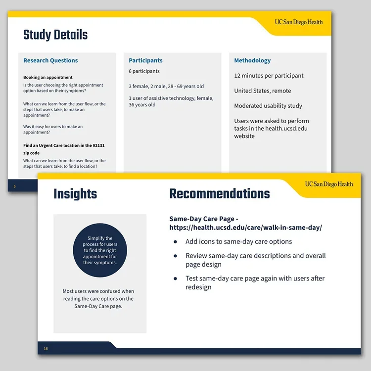
Research design: Developed comprehensive research background, methodology, and targeted research questions
Participant recruitment: Sourced and screened users for testing sessions
Session scheduling: Coordinated logistics across participants and stakeholders
Test script development: Created structured protocols for consistent data collection
Research execution: Conducted usability testing sessions
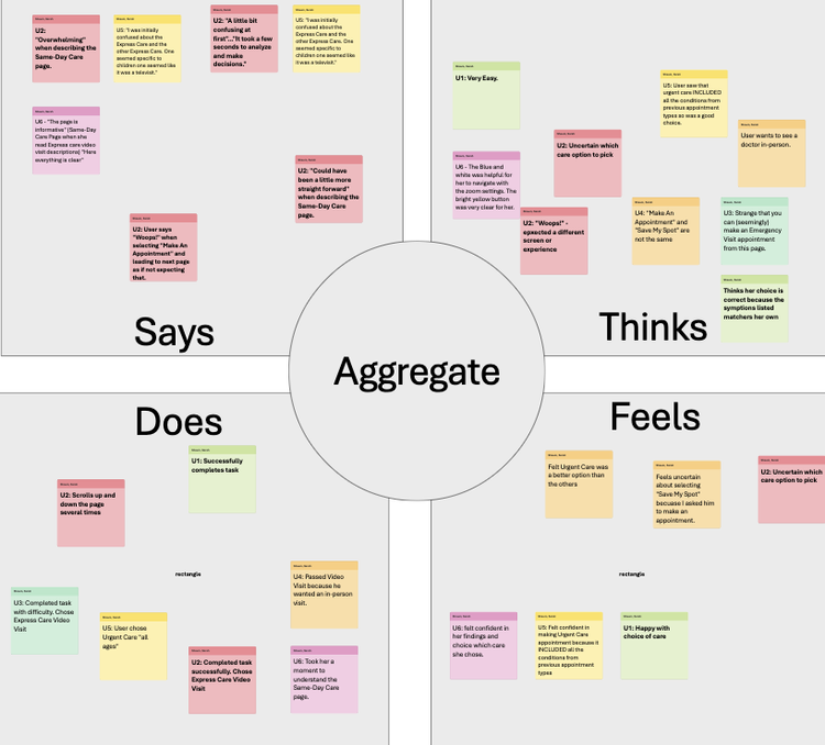
Data synthesis: Analyzed findings using affinity diagrams, empathy maps, and insight identification
Stakeholder presentation: Communicated findings and design recommendations
I collaborated with the creative team and web development team to translate research insights into implemented design solutions.
-
Usability Testing:
Conducted moderated sessions focused on appointment scheduling tasks
Tested symptom-based care pathways (Express Care, Urgent Care, Emergency Care)
Observed user behavior and collected qualitative feedback
Analysis Methods:
Affinity diagramming to identify patterns across sessions
Empathy mapping to understand user emotions and pain points
Insight identification to translate observations into actionable recommendations
Constraints:
Limited time and resources prevented A/B testing validation
Needed to prioritize quick-win improvements over extensive redesign
-
Primary Friction Points:
Users struggled to differentiate between care options (Express Care vs. Urgent Care vs. Emergency Care)
Text-only buttons lacked visual distinction, causing hesitation and confusion
Symptom-based decision-making required too much cognitive effort during stressful moments
User Needs:
Quick visual cues to identify appropriate care level
Clear differentiation between care options at a glance
Reduced cognitive load when making time-sensitive healthcare decisions
Opportunity: Simple design updates could significantly improve care selection speed and confidence without requiring complex technical changes.
-
Design Recommendations Implemented:
Transformed text-only care buttons into icon-based buttons with visual representations
Created distinct visual identity for Express Care, Urgent Care, and Emergency Care
Improved scanability and reduced decision-making time for users selecting care
Value Produced:
Streamlined appointment scheduling process based on specific symptoms
Enhanced overall usability and user satisfaction
Established research-driven design iteration process for future improvements
Demonstrated ROI of user research in driving impactful design decisions
How Research Informed Design
User interviews revealed that visual differentiation was critical for quick decision-making. Working with creative and web development teams, I translated this insight into concrete design specifications—moving from text-only buttons to iconography that helped users immediately identify the appropriate care level they needed.
What I Learned
Research Doesn't Always Require Complexity
Initially, I wanted to conduct A/B testing to validate design changes, but time and resource constraints made that impossible. I learned that sometimes the most impactful research comes from straightforward usability testing that identifies obvious friction points. The text-to-icon button change was a simple fix with significant impact—proof that research value isn't measured by methodology complexity.
Stress Affects Decision-Making
Testing appointment scheduling taught me how differently users behave when seeking healthcare versus browsing general content. People in healthcare scenarios have reduced cognitive capacity due to stress or illness. This reinforced that healthcare UX requires minimizing mental effort at every step—what seems "clear enough" in other contexts isn't sufficient when someone is worried about their health.
Visual Design as Research Translation
My role didn't end with delivering insights. Collaborating with designers to create the actual icon representations taught me how much nuance exists in translating research findings into visual solutions. "Make it more visual" is not actionable—but "users need to distinguish care urgency at a glance without reading" gives designers what they need to create effective solutions.
Quick Wins Build Research Credibility
This project's relatively fast turnaround and visible design implementation helped establish trust in user research across the organization. Sometimes researchers get caught up in pursuing perfect methodology when stakeholders need quick evidence to make decisions. Learning to balance rigor with pragmatism has made my research more impactful.
How I Worked with Others
Cross-Functional Partnership
I worked closely with digital experience, creative and web development teams throughout this project—not just at handoff.
Why This Project Matters
Appointment scheduling is often the first meaningful interaction patients have with a healthcare website. If this experience is frustrating or confusing, it erodes trust before care even begins. This project demonstrated that even small, research-informed design changes can significantly improve how patients navigate critical healthcare decisions.
By focusing on one high-impact user journey and delivering actionable insights quickly, this work showed how user research drives tangible improvements. The icon-based care buttons remain in use today, helping thousands of patients quickly identify the right care option when they need it most.
Research Methods: Usability testing • User interviews • Affinity diagramming • Empathy mapping • Task analysis
Skills Applied: Moderated research • Participant recruitment • Script development • Qualitative analysis • Design collaboration • Stakeholder presentation • Healthcare UX


