Sound Body Sound Mind
Translating Biofeedback into Musical Wellness
UX/UI Design | Educational Project | Mobile App Concept
The Challenge
As part of the Visual Elements of UI Design course from the California Institute of the Arts, I designed a mobile app that transforms heart rate data into musical soundtracks, helping anxious individuals monitor stress levels through innovative biofeedback—all while learning fundamental UI design principles and interface conventions.
The Concept
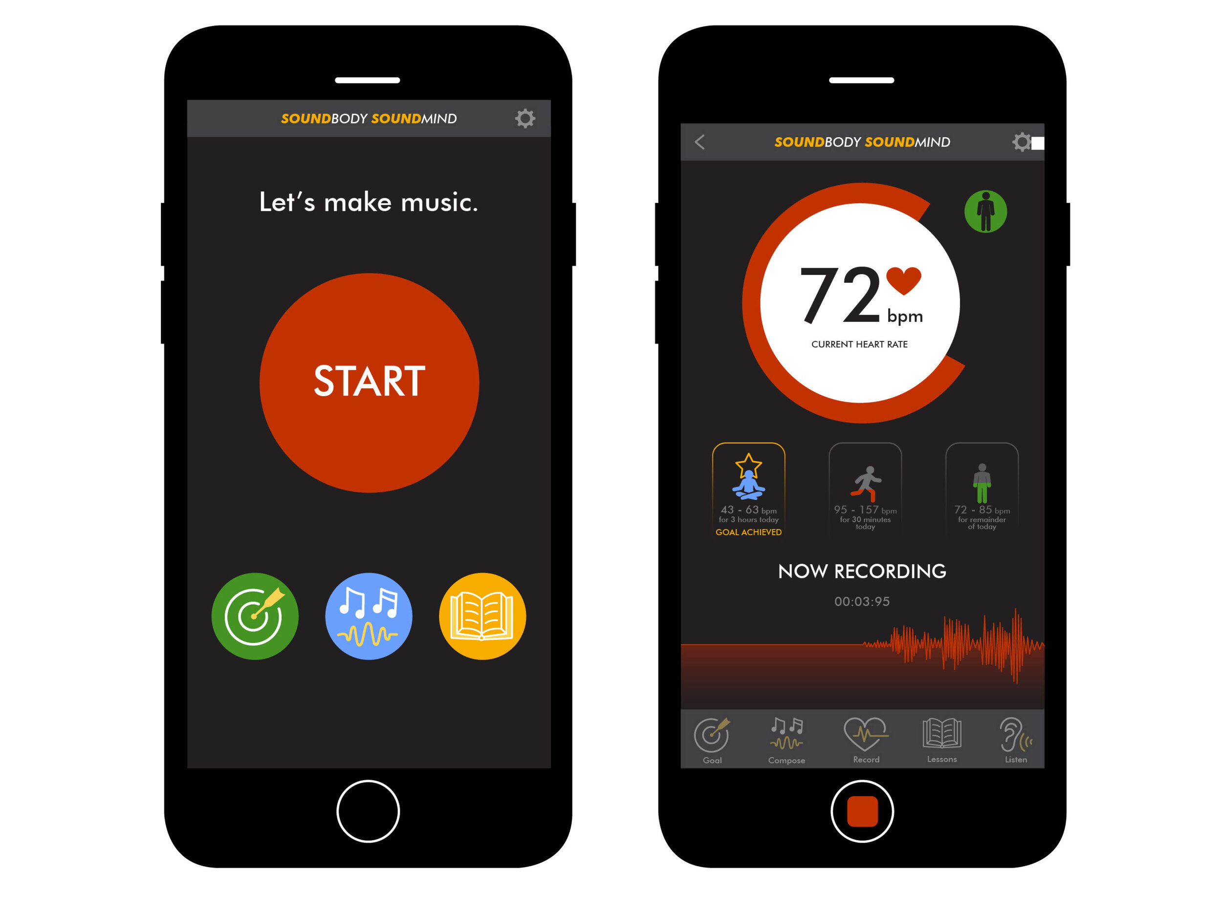
Sound Body Sound Mind is a heart rate monitoring mobile app that turns your body's electrical signals into a musical soundtrack, providing immediate biofeedback for people managing anxiety and stress.
Personal Inspiration: This concept grew from a previous art project where I transposed my sleeping brainwaves into music. I wanted to explore how converting biological data into sound could serve a therapeutic purpose for people managing daily stress.
The Innovation: Rather than presenting heart rate as clinical numbers and graphs (which can increase anxiety), the app translates physiological data into music—creating a meditative, artistic experience that helps users understand their stress levels intuitively while simultaneously providing calming auditory feedback.
The Problem This Solves
Anxiety Monitoring Paradox: Traditional stress monitoring apps present data clinically (heart rate numbers, stress scores, red warning indicators), which can paradoxically increase anxiety.
Disconnect Between Data and Experience: Numbers and graphs require interpretation—users must translate "125 bpm" into understanding of their internal state.
The Opportunity: An app that monitors stress AND provides calming intervention simultaneously through musical biofeedback—turning the monitoring itself into a meditative, therapeutic experience.
Learning Objectives
This educational project developed specific UI design competencies:
Understanding interface conventions and mobile app design patterns
Setting cohesive visual identity appropriate for target audience
Designing functional, aesthetically consistent interface elements
Creating icon sets and reusable design systems
Applying visual hierarchy through typography, color, and spacing
Design Process
-
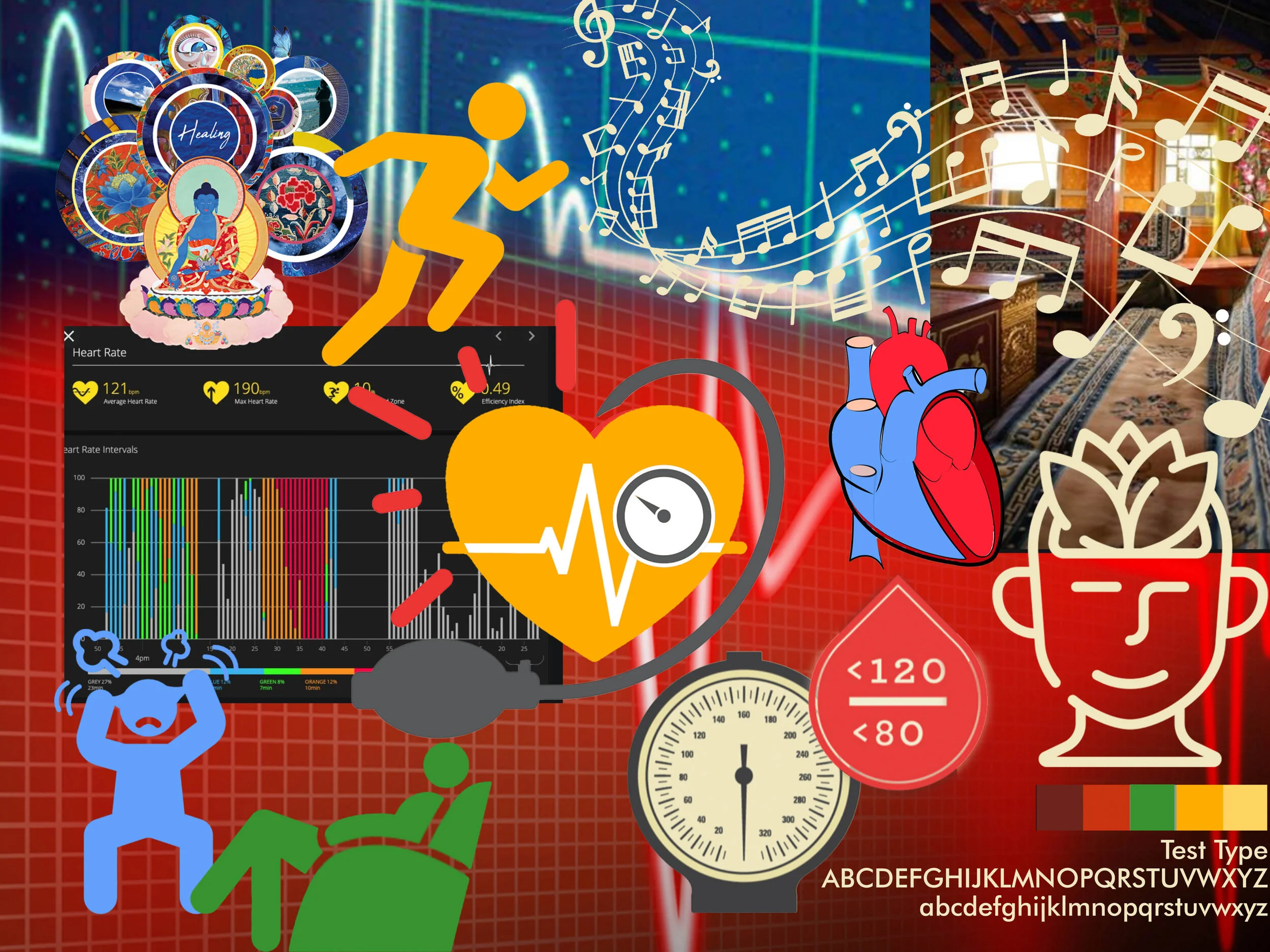
Created comprehensive mood board establishing visual direction and emotional tone for anxious individuals seeking calm, not clinical patients seeking medical intervention.
Visual Direction:
Calming color palettes (cool blues, soft purples, gentle gradients)
Natural, organic imagery (water, sky, abstract flowing forms)
Minimalist layouts preventing visual overwhelm
Musical and sound wave visualizations
Strategic Decisions:Avoid medical/clinical aesthetics (no red alerts, sharp angles, sterile interfaces)
Embrace fluidity and movement (representing music and natural body rhythms)
Prioritize visual calm (every design choice reduces rather than increases stimulation)
-
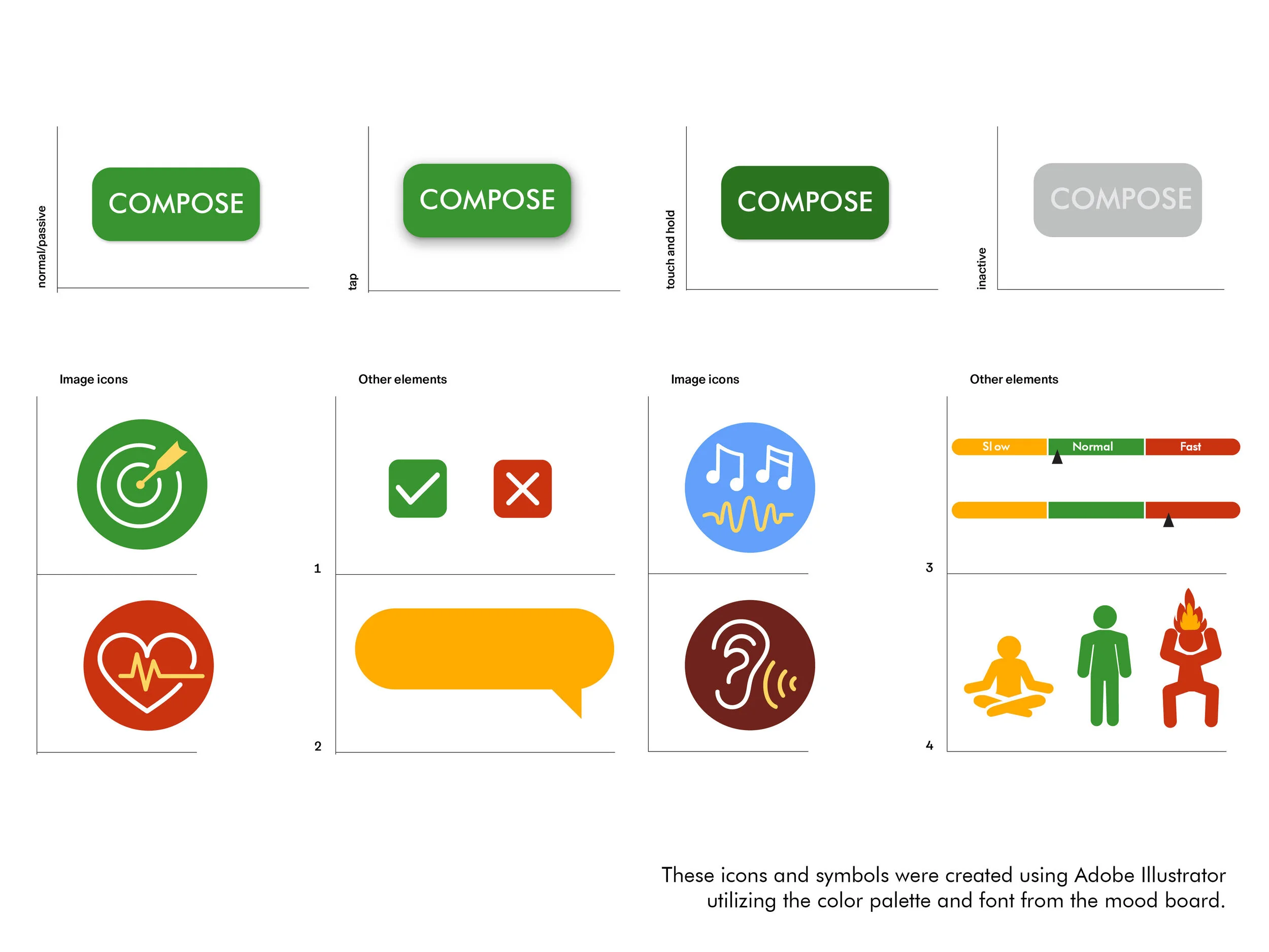
Created comprehensive icon set representing app functions:
Icon Categories: Biometric functions, musical elements, wellness actions, navigation
Design Approach:
Consistent line weight and organic, flowing shapes
Intuitive symbolism requiring minimal learning
Scalable vector design working at various sizes
Cohesive visual language supporting overall calm aesthetic
-
Designed complete mobile app screens demonstrating interface conventions:
Key Screens: Onboarding, home/dashboard with musical visualization, music settings, history/tracking, meditation mode
Visual Hierarchy Decisions:
Typography: Large, clear headings with generous line spacing and accessible sans-serif typeface
Color: Dominant calm blues and purples with subtle gradients, minimal contrasting colors
Layout: Generous white space, centered balanced layouts, clear separation between information types
Key Design Decisions
Musical visualization over clinical data — Abstract visuals and sound convey heart rate intuitively without anxiety-inducing numbers
Calming color palette — Cool blues and purples based on color psychology research showing cool tones reduce arousal
Organic visual language — Curved lines and flowing shapes mirror natural body rhythms and musical flow
Minimal text — Icon-driven interface reduces cognitive load for anxious users
What I Learned
Interface conventions reduce cognitive load. Visual hierarchy directs attention without words. Mood boards prevent aesthetic drift. Design systems create consistency across screens.
Skills: UI design • Visual hierarchy • Icon design • Mood boarding • Design systems • Adobe Illustrator • Mobile interface design
Deliverables: Final UI designs • Mood board • Custom icon set • Complete design system