Oakhull Investments
Building Trust Through Cohesive Brand Experience
Web Design & Multi-Channel Campaign | Financial Services | 2025
The Challenge
Oakhull Investments needed a digital presence that would build immediate credibility with prospective investors. The website had to communicate trustworthiness and sophistication while making complex real estate investment opportunities accessible—all part of a cohesive brand experience spanning web, print, social media, and video.
The Problem
Investment firms face unique trust barriers where weak digital presence actively discourages investors. Oakhull needed to address three core issues:
• Building credibility in a skeptical industry where digital first impressions directly impact investment decisions
• Reaching multiple audiences (prospective investors, existing clients, financial advisors) with clear communication about investment philosophy and specific opportunities
• Maintaining consistency across channels to reinforce professionalism, since investors research through multiple touchpoints before committing
The solution required differentiation from generic financial services websites while preserving the category's professional standards.
Business Objectives
Business Objectives
Establish immediate trust and credibility with prospective investors evaluating Oakhull's capabilities and track record
Communicate investment philosophy and strategy clearly to sophisticated financial decision-makers
Create cohesive brand experience across web, print, social, and video touchpoints
Showcase specific investment opportunities (Shady Grove property) with compelling, detailed presentations
Support multi-channel investor journey from initial awareness through evaluation to conversion
Differentiate from generic financial services competitors through strategic brand consistency and clear messaging
My Role & Approach
As the lead designer on this project working with 1558 Brand Agency, I was responsible for creating a cohesive visual brand system across multiple media types while the content team developed the strategic messaging and investment storytelling.
My Responsibilities:
Website design (Figma)
Shady Grove property landing page design
Printed brochure design and layout
Social media design templates and assets
Video brochure design and visual treatment
Brand consistency across all deliverables
Collaboration with project manager, CEO, and content team
Collaborative Team:
Content Team: Strategic messaging, investment storytelling, copywriting
Project Manager: Timeline coordination, stakeholder management, deliverable tracking
Design Lead (me): Visual design, brand application, multi-channel execution
-
Prospective Investors
Existing Clients
Financial Advisors
-
Core Concept: Create a visual identity that communicates trust through restraint, sophistication through simplicity, and competence through meticulous attention to detail.
Visual Principles:
Clean, Professional Aesthetic: Refined layouts with generous space, sophisticated typography, and restrained color palette. Every element communicates "we take your financial future seriously."
Consistent Brand Application: Same visual language, design patterns, and brand elements across website, brochures, social media, and video—creating recognizable, trustworthy presence regardless of touchpoint.
Content-First Hierarchy: Design supports and elevates the content team's strategic messaging rather than competing with it. Clear typography, logical information architecture, and intuitive navigation let the investment story take center stage.
Multi-Channel Execution
Video Previewing the Apex Website
-
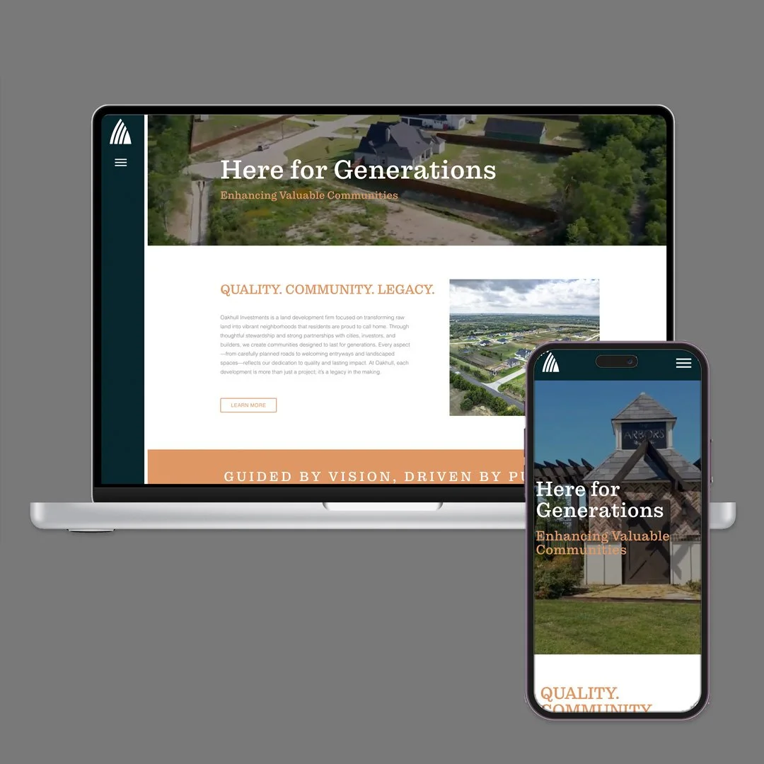
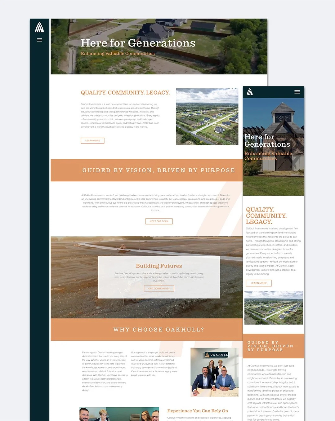
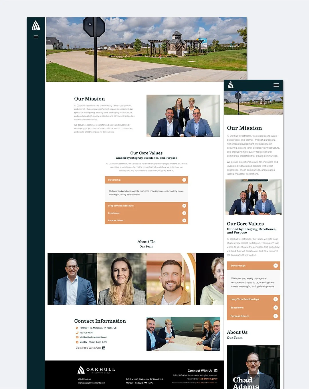
Key Sections:
Homepage: Investment philosophy and firm overview establishing immediate credibility
Investment Opportunities: Detailed presentations of current offerings (including Shady Grove)
About/Team: Leadership expertise and track record building trust
Design Decisions:Typography: Professional serif typefaces for body content (traditional, trustworthy) paired with clean sans-serif for headlines and navigation (modern, accessible)
Color Palette: Sophisticated, restrained colors avoiding both aggressive "finance red" and generic "trust blue"—creating distinctive identity within professional parameters
Photography Strategy: Real property photography and authentic team imagery (never generic stock photos)
White Space: Generous spacing preventing cluttered feeling while guiding eye through content hierarchy
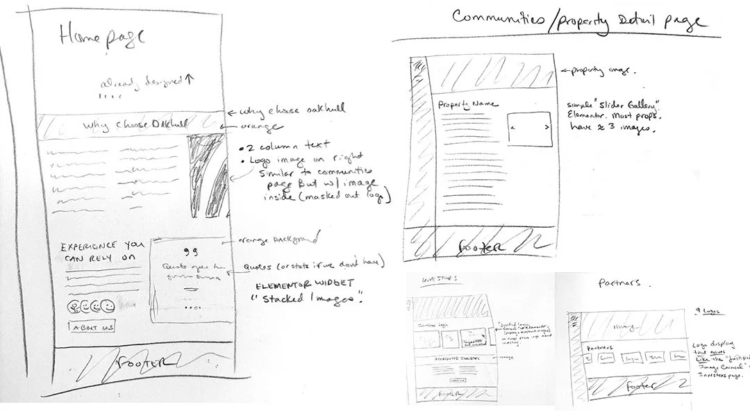
Wireframing Process (Figma): Developed comprehensive wireframes before visual design.
-
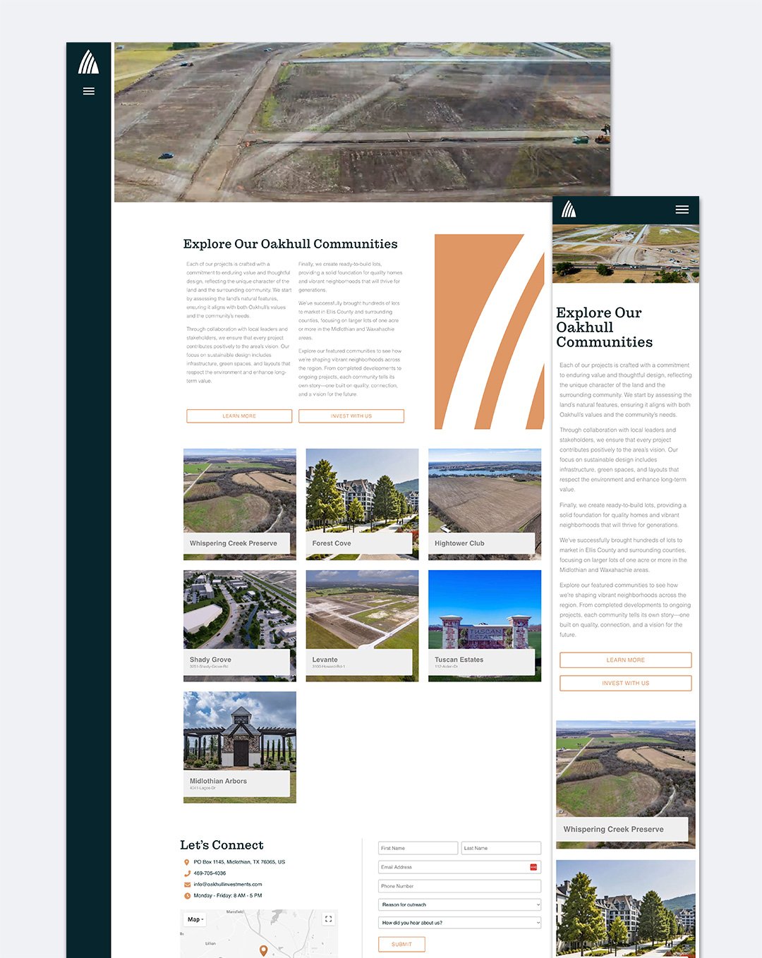
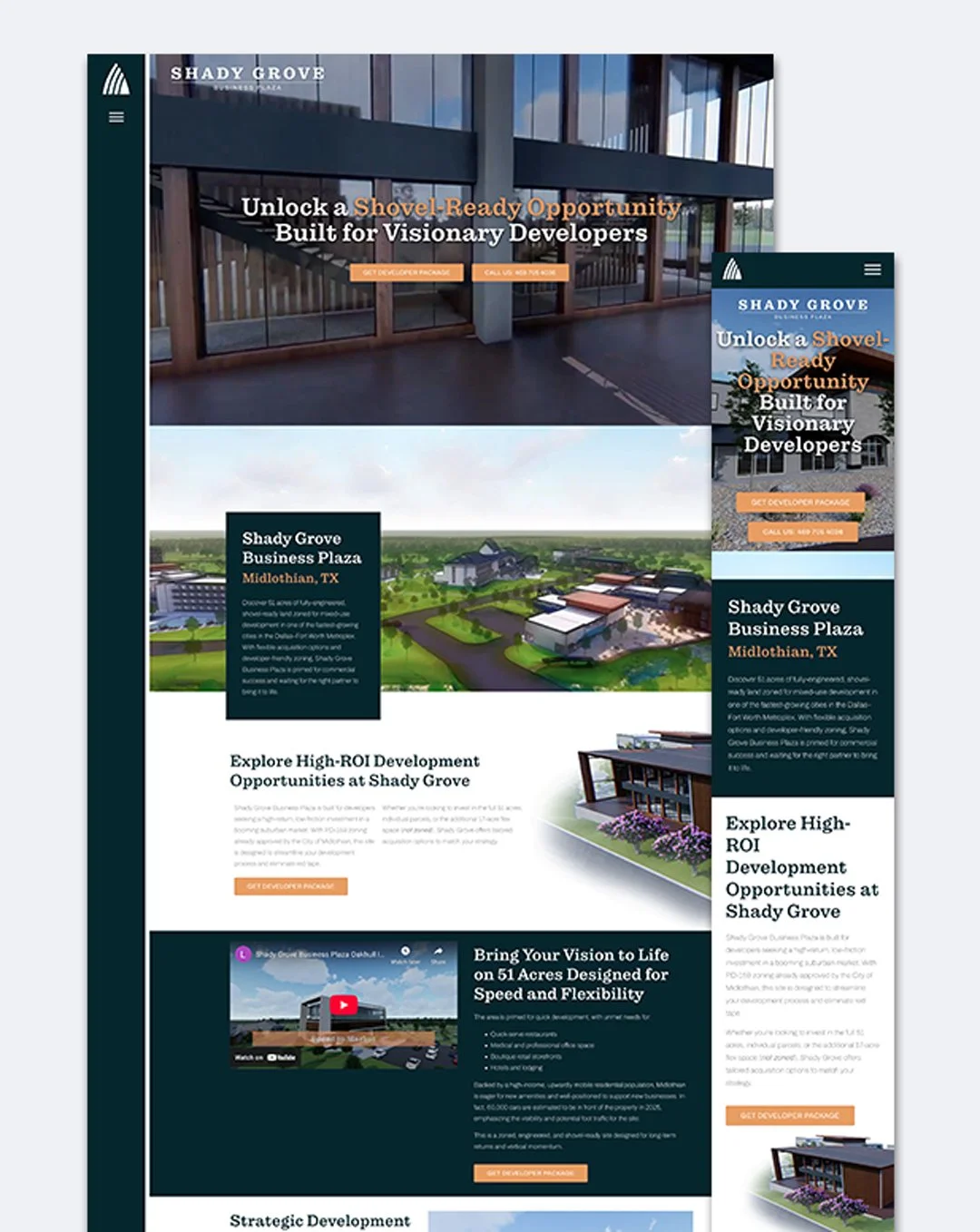
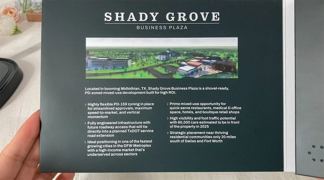
Created dedicated landing page for featured real estate investment opportunity with detailed property information, financial projections, location advantages, and clear calls-to-action for interested investors.
Strategic Purpose:
Serve as destination for targeted marketing campaigns
Provide shareable link for advisor referrals
Offer comprehensive due diligence information in organized format
Design Focus:
Clear property visualization through professional photography
Financial data presented in scannable, digestible formats
Location/market information supporting investment thesis
Prominent but appropriate CTAs for inquiry and materials download
-
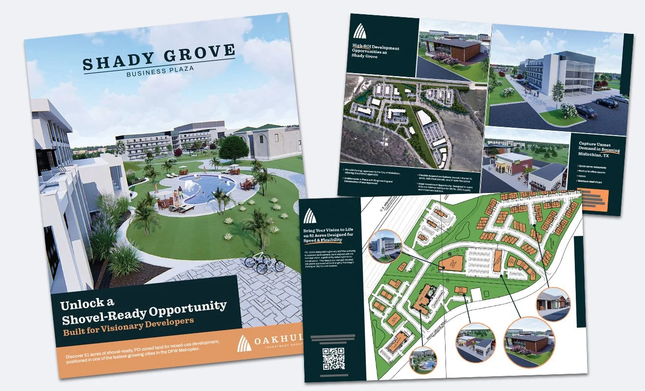
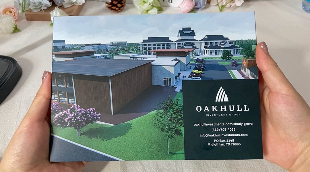
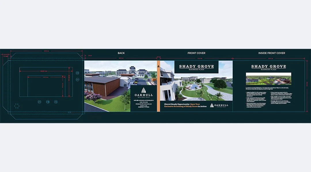
Designed high-quality printed brochure serving as physical brand representation for investor meetings, advisor referrals, and direct mail campaigns.
Design Considerations:
Premium paper stock and printing quality matching digital professionalism
Consistent visual language with website (typography, colors, layouts)
Physical format optimized for easy handling and reference
Content hierarchy allowing quick scanning or deep reading
Strategic Purpose: Physical materials signal investment in brand quality and provide tangible reference investors can review during decision-making process without screens.
-
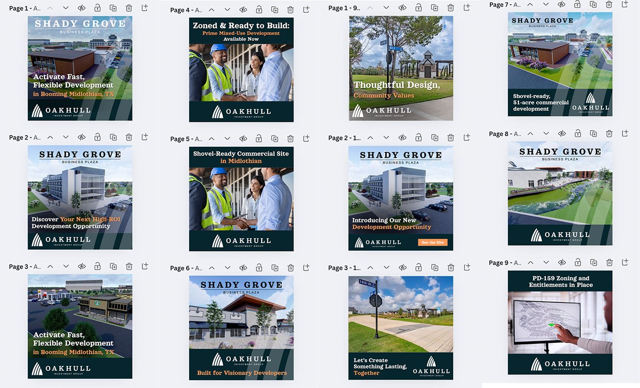
Created social media design templates in Canva and asset library enabling consistent brand presence across LinkedIn, Facebook, and other platforms where investors and advisors engage with financial content.
Design System:
Branded post templates for investment updates, market insights, company news
Consistent visual treatment maintaining professionalism on casual platforms
Scalable system allowing content team to create posts without designer involvement
Strategic Purpose: Maintain brand visibility and thought leadership positioning between major investor touchpoints, building familiarity and trust over time.
-
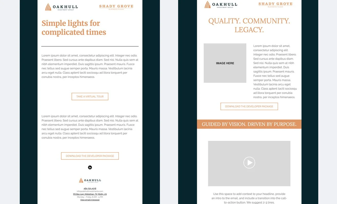
Designed two professional email template options in Mailchimp providing the client with flexible frameworks for ongoing investor communications.
Template Approach:
Two distinct layout options allowing content variety while maintaining brand consistency
Customizable headline areas for different communication purposes (investment alerts, market updates, firm news)
Lorem ipsum placeholder text demonstrating content hierarchy and readability
Modular structure enabling client to populate with specific messaging as needed
Design Decisions:
Responsive layouts optimized for desktop and mobile email clients
Consistent visual treatment matching web and print materials
Clear typography hierarchy guiding readers through content
Strategic white space preventing information overload
Strategic Purpose: Provided ready-to-use templates enabling the client to maintain professional, brand-consistent investor communications without requiring designer involvement for each send. Template options offer flexibility for different message types while ensuring visual cohesion across all touchpoints.
-
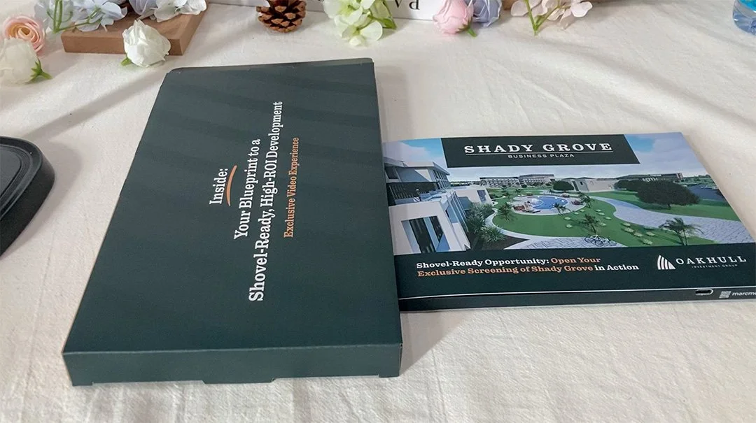
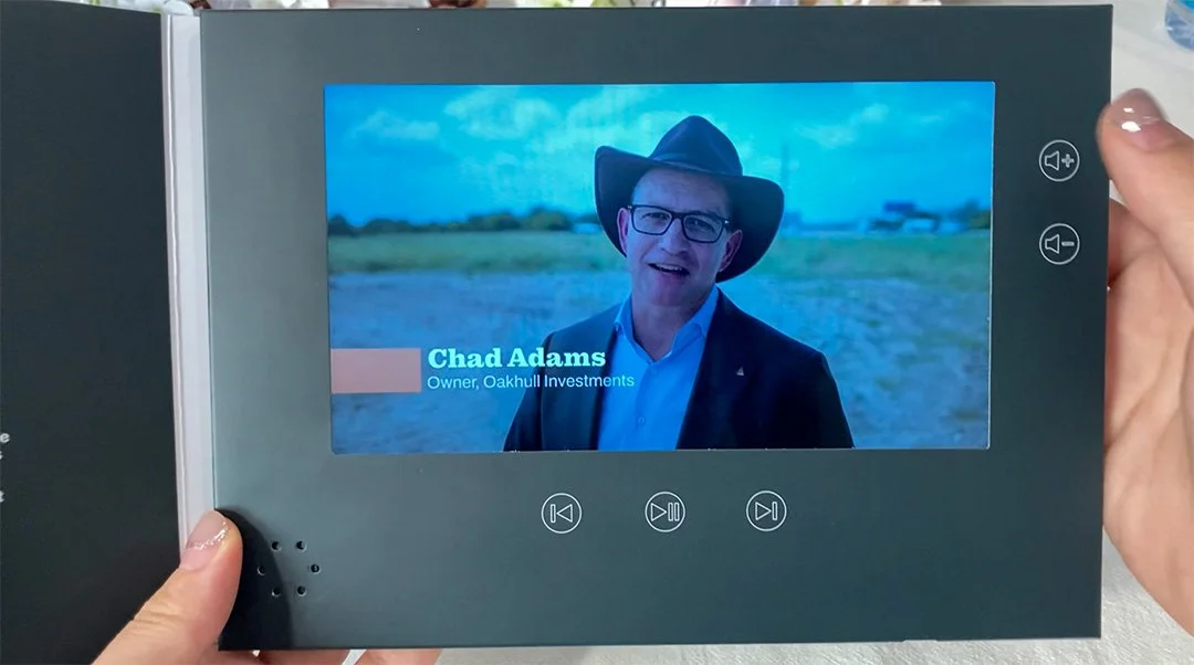
Designed visual treatment for video brochure—premium physical format featuring embedded screen playing promotional video content.
Design Integration:
Physical packaging design matching overall brand system
Video content visual treatment (titles, graphics, transitions) consistent with other materials
Premium presentation format signaling investment quality and attention to detail
Strategic Purpose: Create memorable, distinctive touchpoint for high-value investor prospects and VIP referral sources, demonstrating commitment to exceptional presentation.
Why This Project Matters
Investment decisions carry significant financial risk—investors evaluate firms holistically across multiple touchpoints before committing. Consistent, professional presentation across all channels signals the operational discipline investors seek in firms managing their money.
Skills Demonstrated:
Cross-media design thinking (web, print, social, video)
Brand consistency while optimizing for different formats
Trust-building design for high-stakes financial contexts
Methods Used: Multi-channel design strategy • Brand system development • Wireframing • Print design • Digital design • Social media templates • Video treatment
Skills Applied: Strategic design thinking • Brand consistency • Figma • Print production • Multi-stakeholder collaboration • Financial services design • Content-first approach
Deliverables: Website design • Shady Grove landing page • Printed brochure • Social media design system • Video brochure treatment • Component library