Fefe's Indoor Play
Sophisticated Playfulness
Web Design | Children's Entertainment | 2025
The Challenge
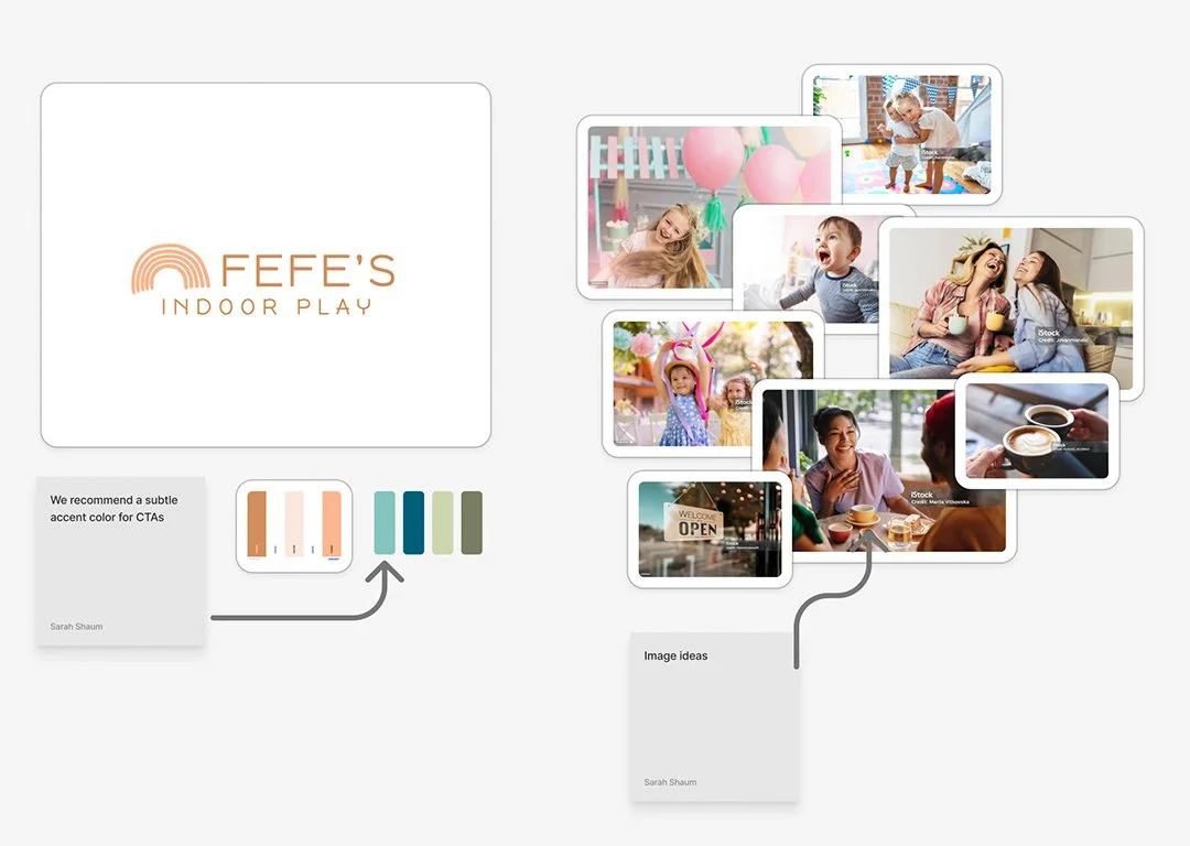
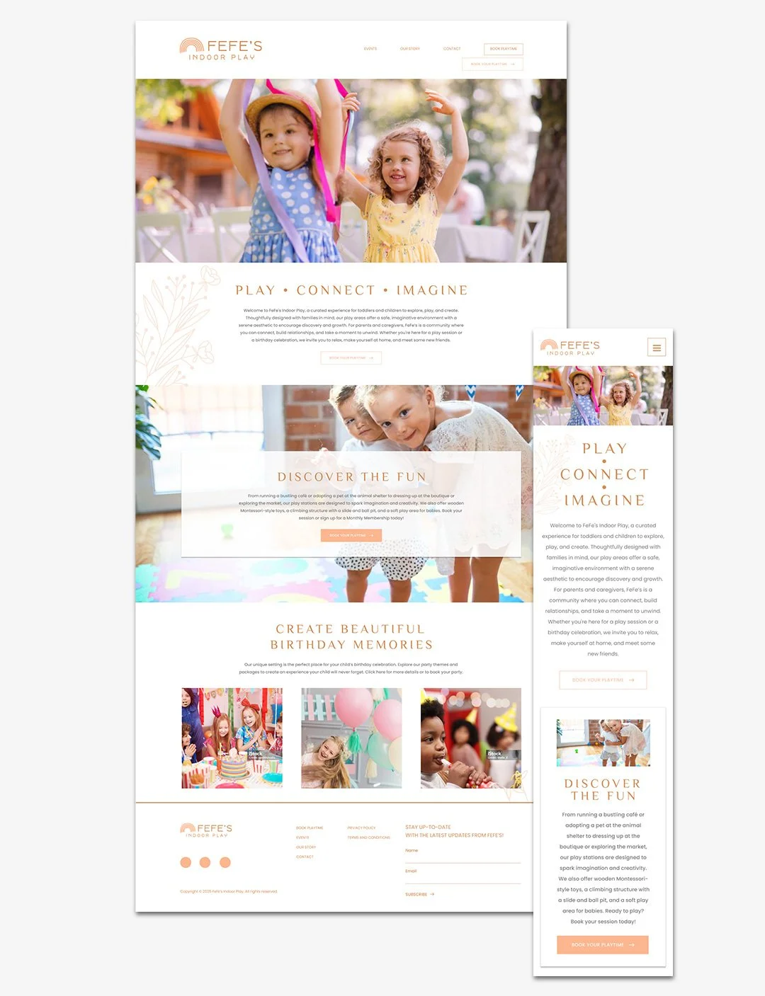
Fefe's Indoor Play needed their first website to enable online bookings and establish market presence—but with an unusual constraint. The client insisted on a single-color palette (warm terracotta, HEX #D38E5A) and sophisticated aesthetic, rejecting the bright, chaotic visuals typical of children's entertainment brands.
The core tension: How do you communicate fun and playfulness for a kids' venue while maintaining elevated, restrained design?
The Problem
No digital presence — A new business with limited discoverability
Dual-audience complexity — Kids want to see the fun; parents need logistics, pricing, and booking capability
Brand vision vs. category norms — Client's sophisticated aesthetic ran counter to every competitor's approach
Business Objectives
Establish professional digital presence to build credibility and discoverability
Enable 24/7 online booking to reduce friction and increase conversions
Differentiate from competitors through elevated, sophisticated visual identity
Serve dual audiences (children and parents) through strategic content organization
Honor client's single-color brand vision while communicating playfulness
My Role
Lead designer with 1558 Brand Agency, responsible for research and visual design system. Collaborated with project manager and developer.
-
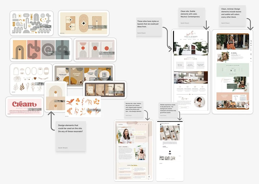
Competitive Analysis revealed indoor play centers universally use bright multi-color palettes, cartoon aesthetics, and high-energy chaos. This creates a differentiation opportunity—but also risk if restraint reads as "not fun."
Cross-Category Inspiration proved more valuable. I studied high-end children's clothing brands and boho furniture sites, finding that sophisticated palettes and organic illustration can communicate warmth and playfulness without visual chaos.
Strategic Insight: Use photography and hand-drawn organic elements to carry the energy that color typically provides.
-
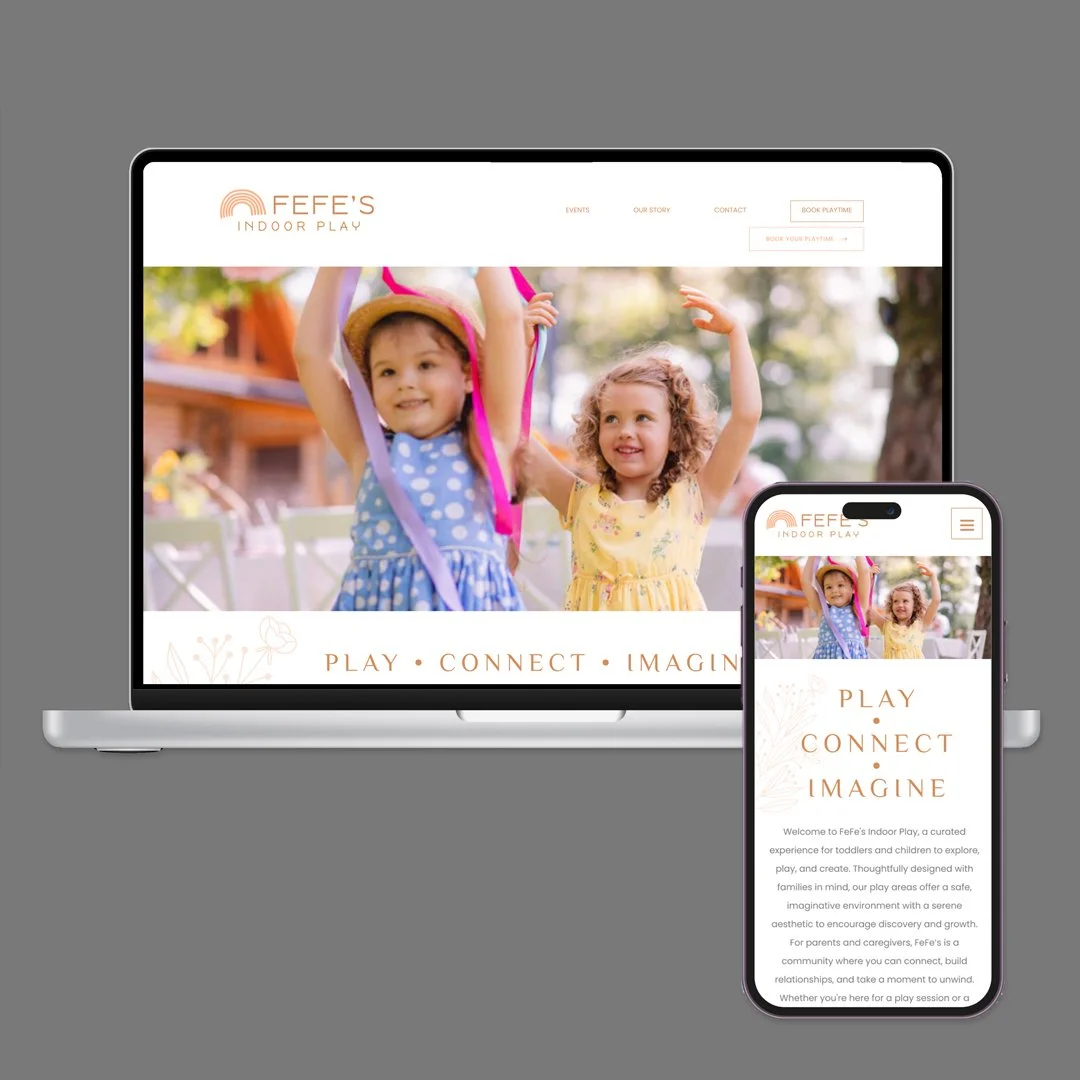
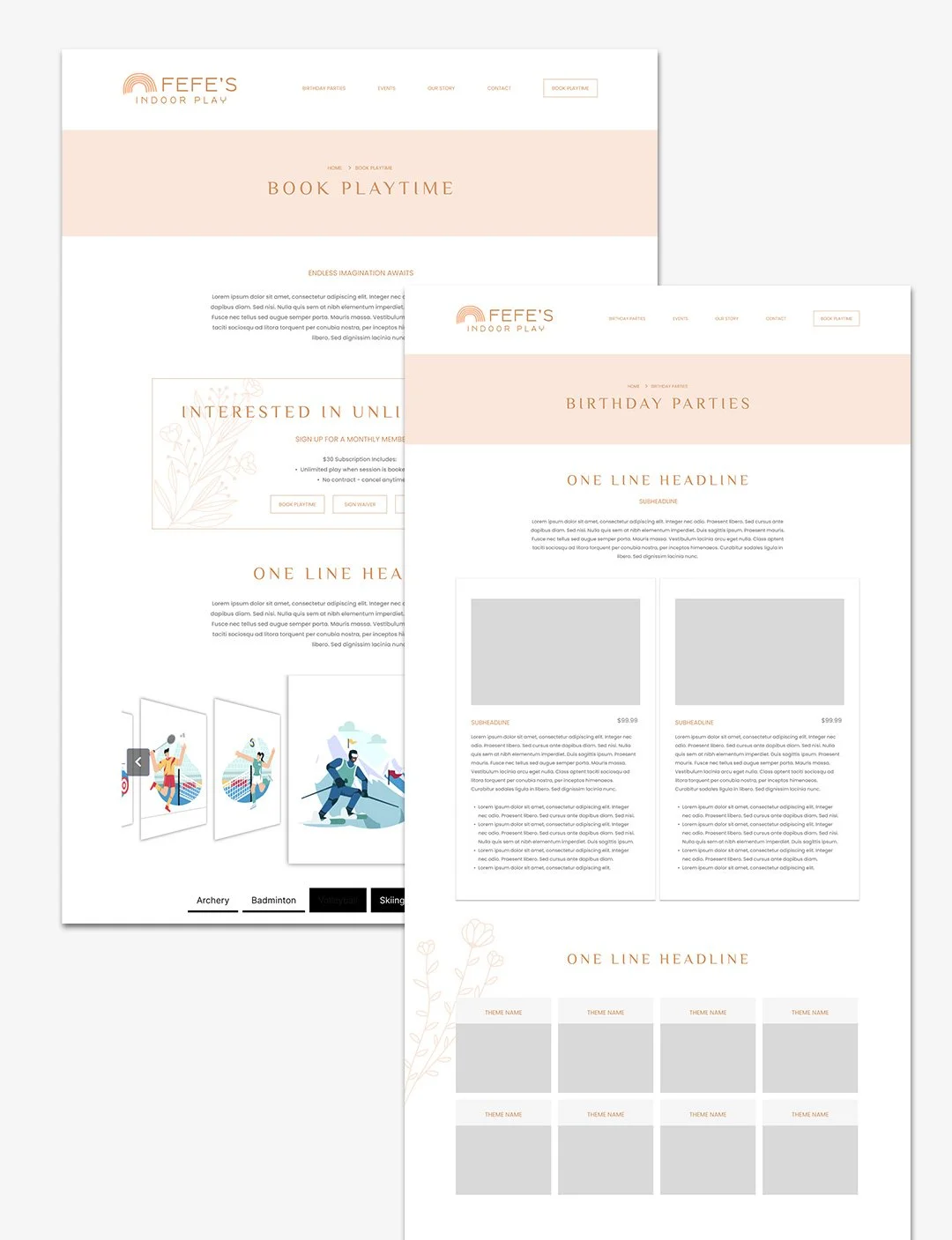
Single-Color System — Embraced the constraint as differentiator. Created hierarchy through tonal variations, generous white space, and texture rather than additional hues.
Organic Illustrations — Hand-drawn botanicals became the playfulness layer, adding warmth and whimsy while maintaining sophistication.
Photography as Energy Source — With color removed as an energy tool, action photography of kids playing carried the emotional weight of communicating excitement.
-
First-ever digital presence established
24/7 online booking capability launched
Distinctive brand differentiation in category dominated by visual chaos
Client vision successfully realized within strict constraints
What I Learned
Constraints force better design thinking than unlimited options. Cross-category research surfaces solutions competitors miss. Photography can do more heavy lifting than expected when color isn't available. Dual audiences need distinct pathways, not compromise solutions.
Methods: Competitive analysis • Cross-category research • Mood boarding • High-fidelity wireframing • Photography art direction
Tools: Figma
Key Constraint: Single-color palette with organic illustration accents