Clayton Youth Enrichment
Building Trust Through Playful, Strategic Design
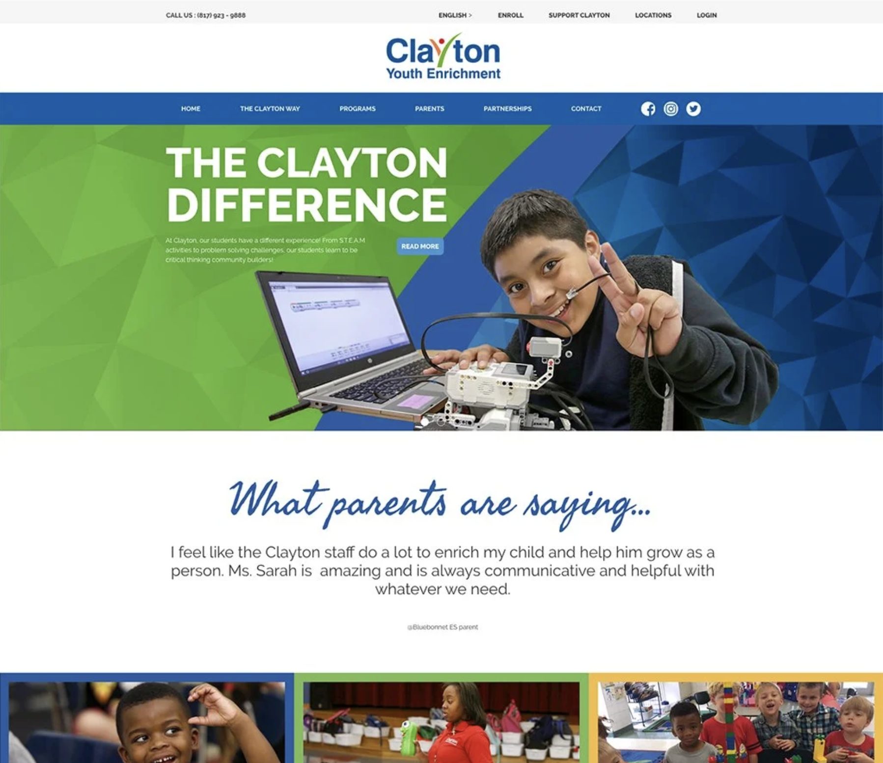
Web Design | Childcare Services | 28+ Page Website
The Challenge
Clayton Youth Enrichment, the largest childcare provider in Fort Worth, Texas, needed a website that could do two things simultaneously: inspire confidence in parents making critical childcare decisions, and reflect the joyful, nurturing environment their programs provide. The existing site was outdated and disconnected from the vibrant brand identity the agency had developed across their marketing materials.
Business Objectives
Align digital presence with established brand identity to create cohesive experience across all touchpoints
Build parent confidence through professional, trustworthy design that reflects program quality
Serve primary audience (prospective parents) while providing clear pathways for enrolled families
Accommodate organizational scale across 28+ pages without sacrificing usability or visual coherence
Position Clayton Youth Enrichment as the premier childcare choice in Fort Worth through design that communicates both professionalism and warmth
The Problem
Clayton Youth Enrichment's website created a jarring disconnect from their bright, professional physical marketing materials, raising trust concerns for parents evaluating childcare options. The outdated structure forced parents to hunt for critical information about safety, curriculum, and availability rather than providing quick answers to high-stakes questions. As Fort Worth's largest childcare provider serving multiple locations and program types, the organization needed a cohesive digital experience across 28+ pages that built confidence rather than creating confusion during one of parents' most important decisions.
-
As the lead designer on this large-scale project, I was responsible for translating Clayton Youth Enrichment's brand into a comprehensive digital experience that served complex organizational needs while remaining clear and inviting for parent users.
My Responsibilities:
Brand guideline development and application
Competitive research and design exploration
Wireframing and information architecture
Visual design across 28+ pages
Design system creation for scalability and consistency
Stakeholder collaboration and iteration
Collaborative Team:
Project Manager (1558 Brand Agency) - timeline, requirements, stakeholder coordination
Copywriters (1558 Brand Agency) - content strategy and messaging
Web Developers - technical implementation and functionality
-
Competitive Analysis: I analyzed childcare provider websites and award-winning sites with bright, colorful, playful design to identify patterns and opportunities.
-
Trust Indicators Matter Most: Successful childcare sites prominently featured credentials, safety information, staff qualifications, and transparent pricing. Sites that buried this information or relied solely on emotional appeals failed to inspire confidence.
Visual Tone Requires Careful Balance: Too corporate = cold and unwelcoming. Too playful = unprofessional and chaotic. The best sites achieved warmth and professionalism simultaneously through strategic use of color, photography, and layout.
Parents Need Clear Pathways: Decision-making research showed parents want to quickly assess program fit (age groups, locations, curriculum), understand logistics (hours, pricing, enrollment), and feel emotional connection (see facilities, meet staff). Sites that forced parents to hunt for this information lost engagement.
Simplicity at Scale Is Challenging: Large organizations with multiple programs risk overwhelming users with too many options presented simultaneously. Successful sites used clear categorization and progressive disclosure.
-
Homepage Strategy: Immediately communicates trust (credentials, longevity, scale) while inviting exploration (bright visuals, clear program categories, emotional storytelling through photography).
Program Pages: Age-specific pages use consistent structure (curriculum, daily schedule, enrichment activities, caregiver qualifications) so parents can easily compare options while feeling confident they're getting complete information.
Location Pages: Facility-specific pages feature unique photography and details while maintaining template consistency, balancing local personality with organizational coherence.
Mobile Optimization: Recognizing that many parents research childcare on phones during commutes or lunch breaks, responsive design ensured full functionality and visual quality across devices.


What I Learned
Brand Guidelines Are Design's Foundation, Not Decoration: Creating the brand guidelines before designing the website fundamentally changed my approach. Rather than making arbitrary aesthetic choices, every design decision referenced established brand standards. This discipline created stronger, more defensible work.
Scale Requires Systems Thinking: 28+ pages forced me to think in systems rather than individual layouts. Early in my career, I would have designed each page uniquely. This project taught me that consistency through reusable components creates better user experiences than variety for variety's sake.
Stakeholder Feedback Improves Work When Process Is Clear: Multiple reviewers could have created chaos, but clear feedback loops and decision-making criteria kept the process productive. I learned to separate subjective preferences from strategic concerns, addressing the latter while confidently defending design decisions against the former.
Why This Project Matters
Childcare decisions carry enormous emotional weight for families. Parents entrust organizations with their children's safety, development, and happiness—the website is often the first impression that determines whether an organization even gets considered. This project demonstrated my ability to design for high-stakes decision-making contexts where both emotional connection and practical information must coexist, where scale and complexity must feel simple and approachable, and where brand consistency across 28+ pages requires systematic thinking rather than page-by-page improvisation.
Successfully serving Clayton Youth Enrichment—Fort Worth's largest childcare provider—required balancing organizational complexity with parent-facing clarity, translating brand identity into functional digital experience, and collaborating across multiple stakeholders with different priorities. The result positioned them as the professional, trustworthy, joyful choice they are.
Methods Used: Competitive research • Award-winning site analysis • Brand guideline development • Design systems • Stakeholder collaboration
Skills Applied: Strategic design thinking • Visual design • Adobe XD • Multi-stakeholder management • Large-scale website design • Brand translation