Brunch Boss
Where Art Meets Appetite
UX/UI Design | Mobile App Concept | 2023
The Challenge
As part of my UX certification capstone project, I wanted to create something that solved a real problem while supporting a local artist who was launching her career. The challenge: design a brunch restaurant discovery app that stood out in an oversaturated market of generic location-based dining apps—and do it in a way that felt joyful, artistic, and uniquely engaging.
The Opportunity
I partnered with Ekaterina Orlovie, a local watercolor artist and close friend just beginning her professional art career, to explore how her distinctive artistic style could transform a functional restaurant finder into an immersive, game-like experience. The goal was to create an app that made discovering brunch spots feel less like scrolling through reviews and more like creating your own culinary story.
-
I conducted a thorough analysis of existing brunch and restaurant discovery apps (Yelp, OpenTable, The Infatuation) to identify gaps and opportunities for differentiation. Most apps prioritized utility over delight—users could find restaurants efficiently but the experience felt transactional rather than engaging.
Key Insights:
Restaurant discovery apps treat food selection as a task to complete, not an experience to enjoy
Visual differentiation is rare—most apps use similar layouts, filters, and review-driven interfaces
No apps integrated artistic elements or gamification in meaningful ways
Users wanted inspiration ("What should I order?") as much as location ("Where should I go?")
The Opportunity: Create a visually distinctive app that lets users play with food choices before committing to a restaurant, making discovery feel creative and exploratory rather than purely functional.
-
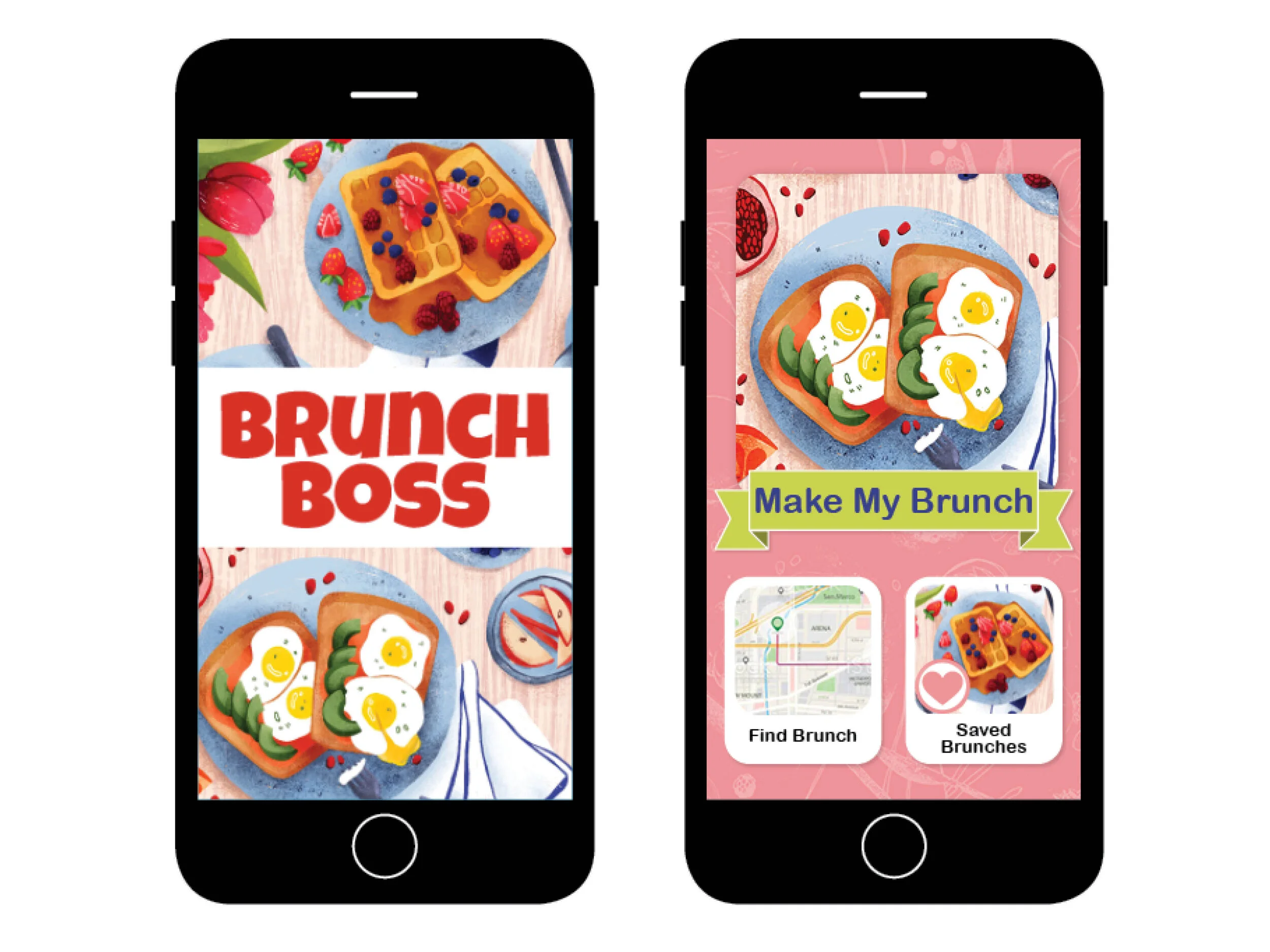
I developed the core concept: users would "create their own brunch" by selecting illustrated watercolor food items (avocado toast, mimosas, pancakes), then the app would recommend nearby restaurants that serve those items. This approach transforms passive searching into active creation—users discover what they want by playing with visual options, then find where to get it.
Process:
Defined functional hierarchy and information architecture
Identified target audience: brunch enthusiasts who value experience and aesthetics alongside convenience
Established goals: make restaurant discovery feel playful and inspiring while maintaining utility
Developed naming strategy that communicated both fun and function
Created testing protocols for validation
-
Before investing in visual design, I created a non-visual paper prototype and conducted moderated usability testing with 4 participants. I facilitated users through a series of tasks, observing behavior in real-time and asking questions to understand their thought processes.
Tasks Tested:
Create a custom brunch by selecting food items
Review restaurant recommendations based on selections
Navigate to restaurant details and save favorites
Adjust preferences and see updated results
What I Learned:
Navigation Confusion: 3 of 4 users initially struggled to understand that selecting food items was the primary search mechanism. They expected a traditional search bar and filter system. This revealed that the innovative interaction model needed clearer onboarding to set expectations.
Delight Factor: Once users understood the concept, all 4 expressed enthusiasm about the "building your meal" approach. One participant said, "This is way more fun than scrolling through endless restaurant lists." The creative interaction resonated strongly—the challenge was communicating it upfront.
Information Hierarchy Issues: Users wanted to see restaurant proximity and price range earlier in the flow. The paper prototype buried this practical information too deep, forcing users to explore multiple screens before getting critical decision-making details.
Favorite Feature Request: 2 users asked if they could share their "created brunch" with friends for group decision-making. This unprompted request validated that the creative aspect had social potential beyond individual use.
What Changed:
Added clear onboarding screens explaining the "build your brunch" interaction model
Elevated restaurant proximity and price indicators to appear immediately with recommendations
Restructured information hierarchy to balance playful exploration with practical decision-making
Identified future feature opportunity: shareable brunch boards for group dining decisions

Wireframing & Visual Design
Based on testing insights, I developed digital wireframes in Adobe InDesign, focusing on logical user flows and intuitive navigation. This was my first formal wireframing experience, and it taught me to think systematically about every interaction—considering not just what users see, but how they move through the experience step by step.
The visual design integrated Ekaterina's watercolor illustrations throughout, creating a cohesive aesthetic that differentiated the app from competitors while maintaining usability. Custom iconography designed in Adobe Illustrator ensured the artistic style extended beyond food illustrations to every interface element.
Design Decisions:
Soft, watercolor-inspired color palette that felt inviting and appetizing
Generous white space to let illustrations breathe and prevent visual overwhelm
Clear, sans-serif typography for readability balanced against decorative artistic elements
Tap-friendly interaction areas sized for comfortable mobile use

-
While Brunch Boss remained a concept project that was not built or launched, it successfully fulfilled its dual purpose: completing my UX certification capstone while providing a real platform for showcasing Ekaterina's artwork to potential clients and collaborators.
Project Achievements:
Demonstrated complete UX process from research through high-fidelity design
Successfully integrated artistic collaboration into functional app design
Validated innovative interaction model through user testing
Created portfolio piece that showcased both strategic UX thinking and visual design skills
Gave emerging artist professional exposure and portfolio material
What Made This Project Successful: The combination of rigorous UX methodology with genuine creative collaboration. Rather than treating the artist partnership as a "nice-to-have" visual layer, I built the entire interaction model around how her illustrations could transform the user experience. The research and testing validated that this artistic approach wasn't just aesthetically pleasing—it made restaurant discovery more engaging and memorable.
-
User Testing Reveals Hidden Assumptions: I assumed the "build your brunch" concept would be immediately intuitive because it felt playful. Testing revealed that innovative interactions need explicit explanation—users can't enjoy what they don't understand. This taught me that delightful experiences require clear onboarding, especially when challenging established patterns.
Balancing Delight and Utility Is Constant Negotiation: Throughout the project, I navigated tension between playful exploration and practical decision-making. Users loved the creative interaction but still needed quick access to location, price, and reviews. Great UX doesn't choose between joy and function—it delivers both in appropriate measure.
Collaboration Enriches Design When Approached Strategically: Working with Ekaterina wasn't just about "making it pretty"—it was about how her artistic perspective could fundamentally shape the user experience. The best creative collaborations happen when both parties contribute to the core concept, not just their respective deliverables.
First Wireframing Experience Taught Me to Think in Flows, Not Screens: Creating my first wireframes forced me to consider not just what each screen contained, but how users moved between them and why. This systematic thinking about user journeys became foundational to how I approach all design work.

Why This Project Matters
In a market saturated with functionally similar apps, differentiation comes from creating experiences that feel distinctive and memorable. Brunch Boss demonstrated that utilitarian tools like restaurant finders can incorporate artistry and playfulness without sacrificing usability—in fact, these elements can make the core function more engaging. By treating the artist collaboration as integral to the UX strategy rather than decorative polish, this project showed how visual identity and interaction design can work together to create something that stands out while still solving real user needs.
Methods Used: Competitive analysis • User research • Concept development • Paper prototyping • Moderated usability testing • Wireframing • Visual design • Artist collaboration
Skills Applied: UX research • Information architecture • Interaction design • Usability testing • Visual design • Adobe InDesign • Adobe Illustrator • Creative collaboration
Tools: Adobe InDesign (wireframes) • Adobe Illustrator (iconography) • Paper prototyping