1558 Brand Agency
Designing from the Inside Out
Web Design | Brand Expression | 2025
The Challenge
As the sole web designer at 1558 Brand Agency, I faced a unique design challenge: redesigning the website for the agency I work for. This meta-project required me to translate our creative team's energy and thinking process into a digital experience that would resonate with prospective clients while authentically representing who we are. The stakes were high—our website is our most visible portfolio piece and the first impression for potential clients evaluating our creative capabilities.
The Problem
The previous website functioned adequately but failed to capture the dynamic, collaborative energy that defines 1558's approach to brand work. CEO and Brand & Marketing Director identified a critical disconnect: the site looked professional but felt static and formal, missing the creative spark and personality that clients experience when working with our team.
Why It Mattered
For a brand agency, the website isn't just a marketing tool—it's a demonstration of capabilities. If we couldn't create a compelling digital experience for ourselves, why would clients trust us to do it for them?
My Role & Approach
As the lead (and only) web designer on this project, I had unusual creative freedom balanced with significant responsibility. The CEO and Brand & Marketing Director provided high-level creative direction emphasizing personality and energy, but the conceptual direction and execution were mine to define.
Collaborative Process:
Creative Direction: Meredith Chase (CEO, Brand & Marketing)
Design & Concept: Sarah Shaum (me)
Development: Andrew Sherington
Assets: Collaborated with internal designers who created custom hand-drawn icons
My Responsibilities:
Research and competitive analysis
Concept development and mood boarding
Visual design and interaction specifications
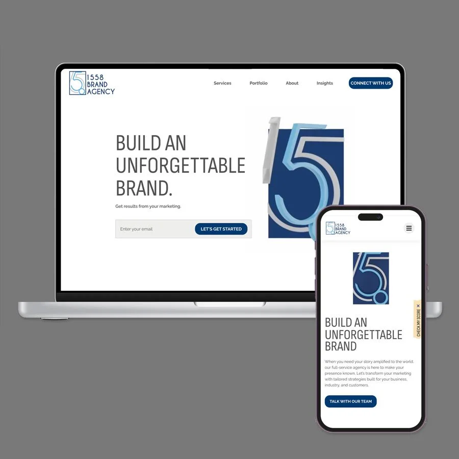
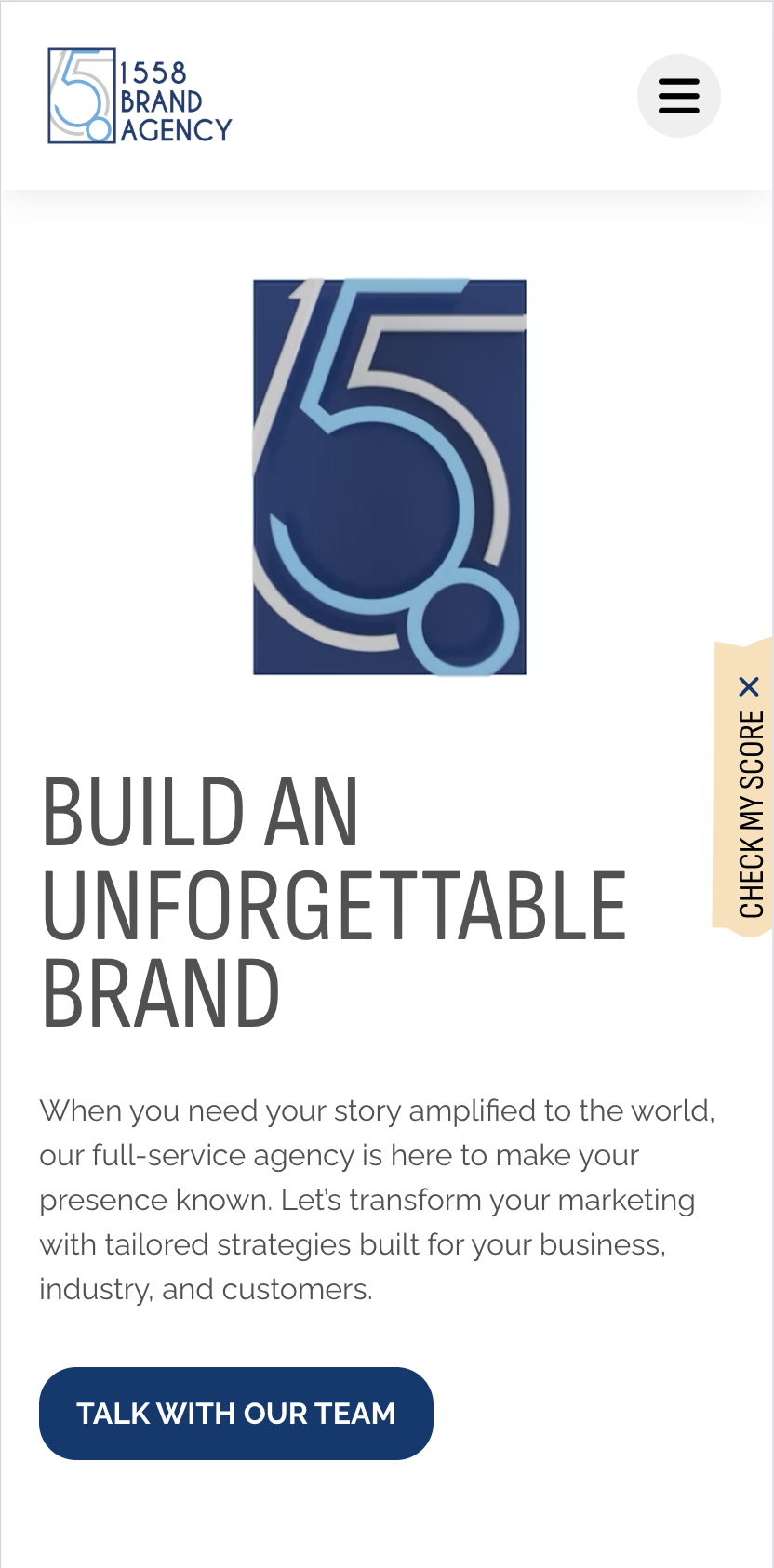
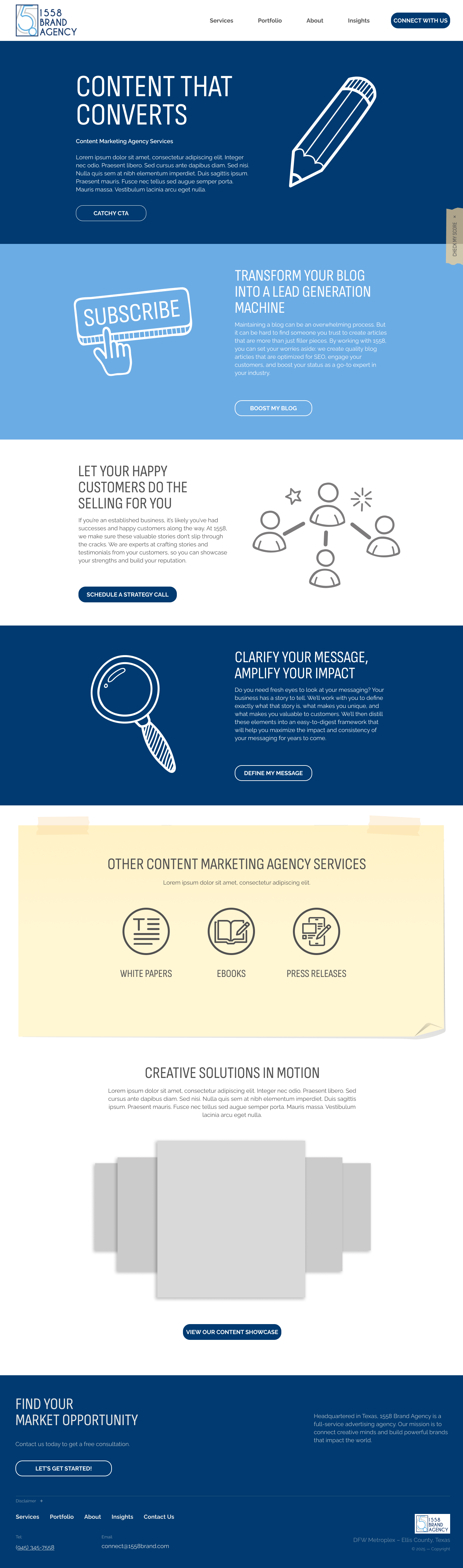
Video Previewing the 1558 Brand Agency Home Page
-
Before presenting concepts, I conducted extensive research into agency websites and award-winning storytelling experiences. I analyzed what made certain sites memorable and how agencies successfully communicated their creative approach through digital experience.
Key Insights:
Most Agency Sites Look Identical: Clean, minimal layouts with case study grids. The opportunity was to stand out by showing our creative process, not just polished outcomes.
Story and Movement Create Engagement: Award-winning sites used animation and progressive disclosure to guide users through narratives rather than presenting static information dumps. Movement communicates energy and intentionality.
Authenticity Beats Perfection: The most compelling agency sites felt human and approachable—showing the messy middle of creative work, not just final presentations. This aligned perfectly with 1558's collaborative, accessible approach to client relationships.
Visual Metaphor Opportunity: One of our designers had created icons with a sketched, hand-drawn aesthetic. This style could become a visual metaphor for the entire site—creative work as an evolving sketch, always iterating, never precious.
-
Core Idea: Design the website to feel like a living creative artifact—loose, energetic, showing the brainstorming and thinking process rather than just polished final work.
Visual Strategy:
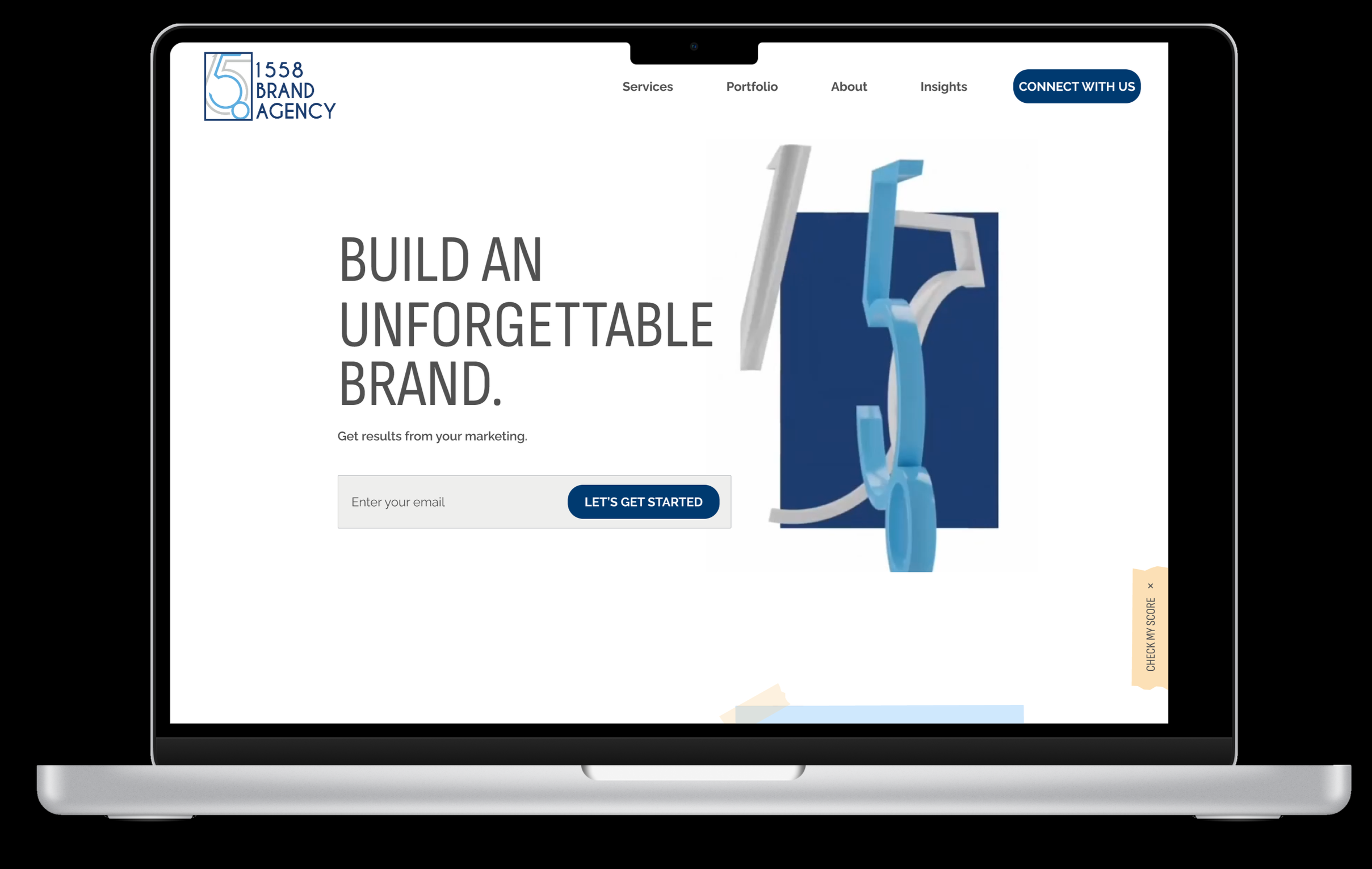
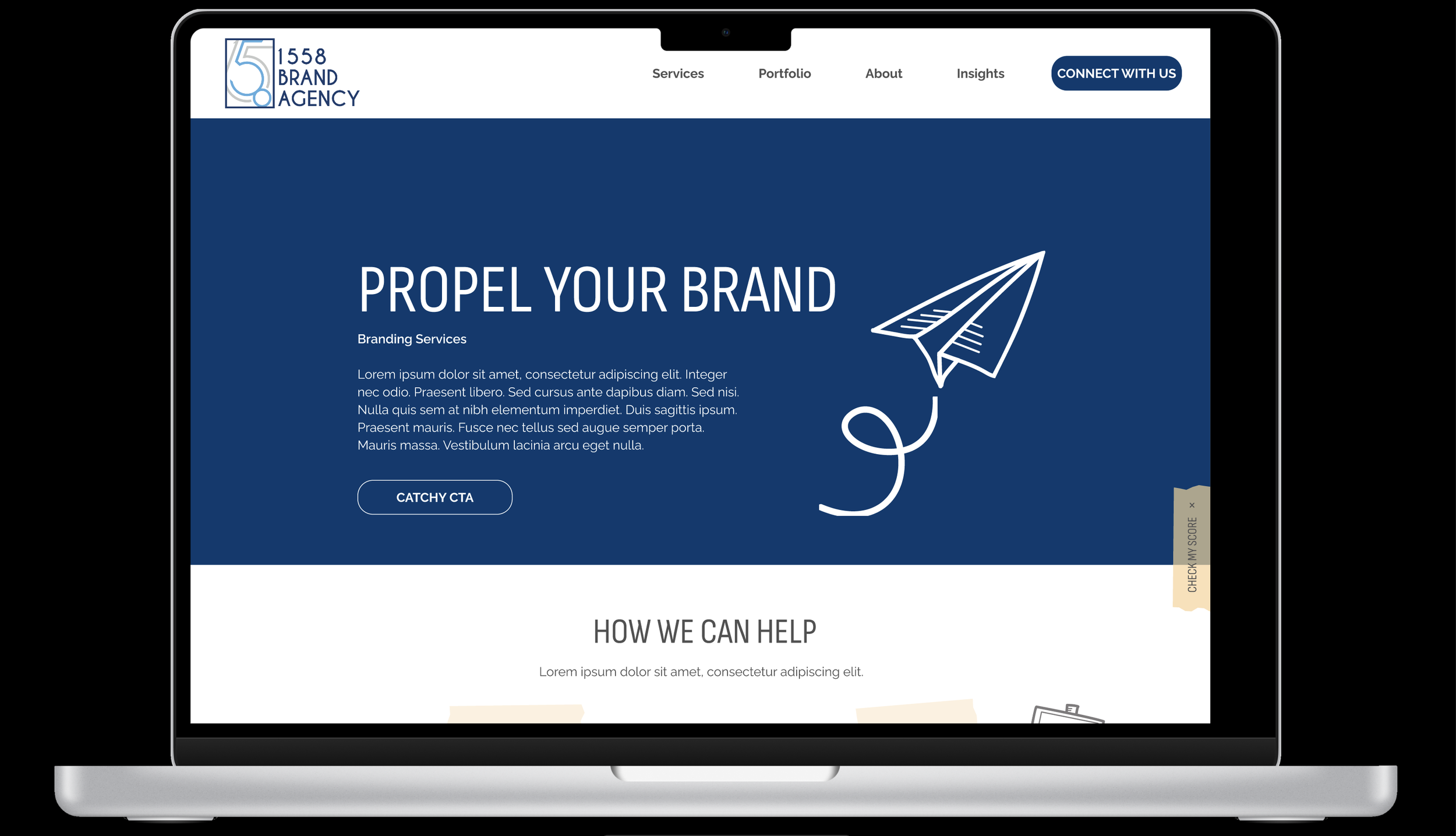
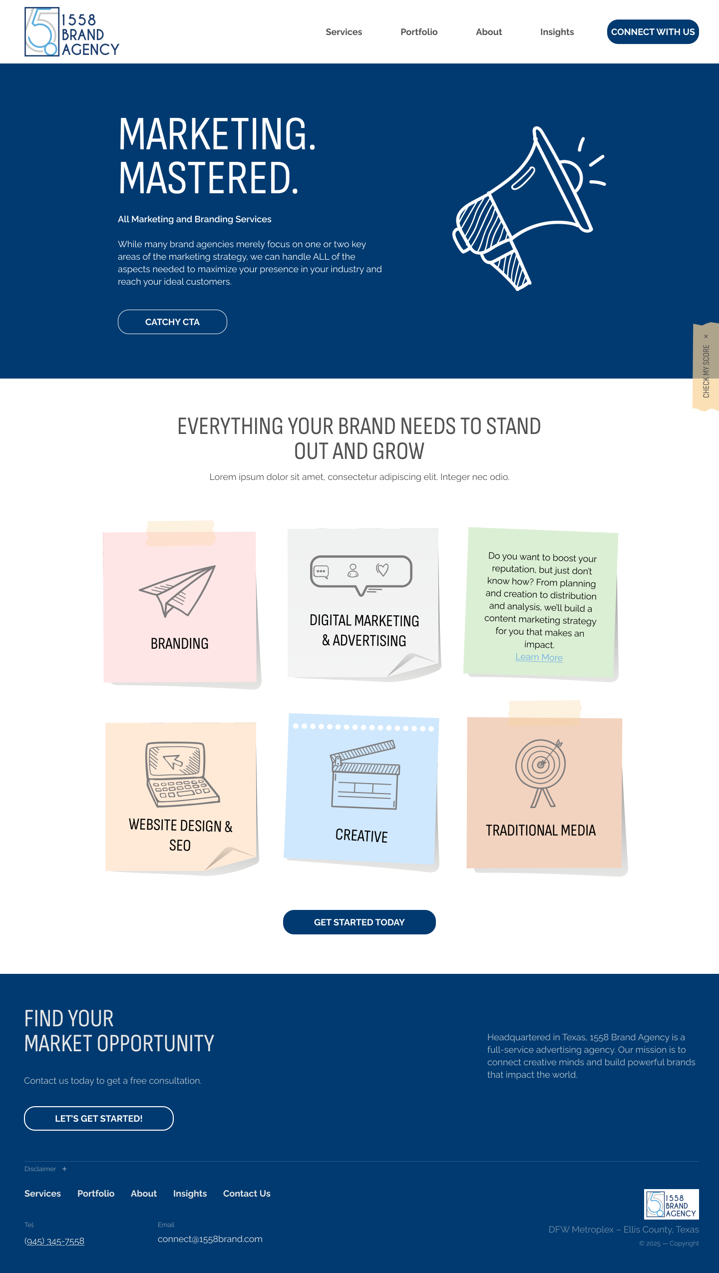
Hand-Drawn Aesthetic: Incorporated the team's sketched icons throughout, establishing a cohesive visual language that felt approachable and creative
Movement as Storytelling: Used animation to guide users through content progressively, creating narrative flow rather than information overload
Directional Elements: Arrows lead users to prominent CTAs, mimicking the way designers annotate sketches and guide thinking
Work-in-Progress Energy: Loose, sketch-like layouts that feel dynamic rather than rigid, suggesting creative process over corporate polish
Playful Iconography: Custom illustrations appear throughout to add personality and visual interest while supporting content hierarchy
Technical Approach:
Designed in Figma, creating a design system and component library
Developed mood boards to establish visual direction and get stakeholder alignment early
Created detailed interaction specifications for animations and transitions
Collaborated closely with developer to ensure animations enhanced rather than distracted from content
-
Why Movement and Animation: Static layouts suggest finished thinking. Animation suggests active, ongoing creativity—which is exactly what clients hire agencies for. Strategic animation also guides user attention, creating a curated experience through content rather than forcing users to parse dense information independently.
Why the Hand-Drawn Aesthetic: Polished vector icons feel corporate and impersonal. Hand-drawn elements feel human, approachable, and creative. This visual style immediately communicates "we think creatively" before users read a single word. It also differentiates us from competitors using identical minimalist aesthetics.
Why Arrows and Directional Elements: Arrows serve dual purpose: they're wayfinding tools (functional) and visual metaphors for strategic thinking (conceptual). Clients hire us to guide their brand strategy—arrows literally show us doing that through the site experience.
Why "Loose" Rather Than "Tight" Layouts: Perfect grid systems and rigid alignment feel safe but uninspired. Slightly loose, asymmetric layouts with intentional imperfection suggest confidence and creative risk-taking. We're not afraid to break rules when it serves the experience.
-
This project offered unusual creative latitude compared to typical client work, where brand guidelines and stakeholder opinions often constrain exploration. However, the freedom came with responsibility: the website needed to represent our entire team's capabilities, not just my personal aesthetic preferences.
The Balance:
Freedom to explore bold, unconventional design approaches
Constraint of representing diverse team members' work and personalities authentically
Freedom to use animation and interaction more liberally than risk-averse clients typically allow
Constraint of maintaining usability and accessibility standards while pushing creative boundaries
The Result: A site that feels distinctively creative while remaining functional and accessible—demonstrating that good design doesn't sacrifice usability for aesthetics.
-
While we haven't tracked formal metrics like conversion rates or lead generation (common limitation for small agency internal projects), the qualitative feedback has been consistently positive.
Client and Professional Feedback: The team has shared praise from clients and professional connections who commented on the site's creativity and energy. For a brand agency, this perception of creative capability directly influences client confidence and project acquisition.
Internal Impact: The website serves as a reference point in client conversations—we can point to our own site as evidence of our approach to brand storytelling, visual identity, and user experience. It's easier to sell capabilities when you can demonstrate them on your own properties.
Design Leadership: The project positioned me as the creative lead for digital experiences within the agency, establishing trust that led to more complex client projects with greater creative autonomy.
What I Learned
Designing for Yourself Is Harder Than Designing for Clients: When the client is your own organization, every decision carries more weight. I felt pressure to represent the team authentically while also pushing creative boundaries—balancing innovation with appropriate representation was more challenging than anticipated.
Creative Freedom Requires Extra Discipline: With fewer constraints came greater responsibility to self-edit. I had to develop clear criteria for evaluating design decisions beyond personal preference—asking "Does this serve users and business goals?" rather than "Do I think this looks cool?"
Movement Must Serve Purpose, Not Just Exist: Early explorations included animation for animation's sake. Through iteration and collaboration with the developer, I learned that every animation needed functional justification—guiding attention, revealing hierarchy, or communicating brand personality. Gratuitous movement distracts; purposeful movement enhances.
Meta-Projects Reveal Design Philosophy: Designing your own agency's site forces you to articulate what you believe good design accomplishes. This project clarified my philosophy: design should feel human, guide users intentionally, and demonstrate creative confidence without sacrificing usability.
Cross-Functional Collaboration Improves Outcomes: Working closely with the developer ensured that ambitious design concepts were technically feasible and performant. Early technical consultation prevented me from designing interactions that would have been impossible or problematic to build.
Why This Project Matters
Agency websites are simultaneously portfolio, marketing tool, and proof of concept. This redesign demonstrated that 1558 Brand Agency practices what we preach—we apply the same strategic thinking and creative problem-solving to our own brand that we offer clients. By designing a site that authentically represents our creative process rather than just showcasing polished outcomes, we differentiate ourselves in a crowded market of agencies with identical-looking websites.
More personally, this project showcased my ability to lead creative direction independently, balance artistic vision with functional requirements, and translate abstract brand qualities (energy, creativity, collaboration) into concrete design decisions. It's one thing to execute someone else's vision—it's another to develop and defend your own.
Methods Used: Competitive analysis • Award-winning site research • Mood boarding • Concept development • Design systems • Interaction design • Developer collaboration
Skills Applied: Strategic thinking • Visual design • Interaction design • Animation specification • Brand translation • Figma • Creative direction • Stakeholder management
Tools: Figma • Mood boarding